


Michael Murphy Home Furnishing
Monday Mood Board – Warm Nuetrals
Mar
There’s no denying it, the surge of homeowners opting to include on-trend, earth tones in their homes over the last few months has us intrigued. Warm creams, tasteful taupes and natural browns feature heavily across the boards of Pinterest, as well as Instagram grids far and wide.
We love how tones like taupe and other earthy colours work well with nearly any interior setting, whether it be a modern, contemporary look you’re aiming for, or if you’re trying channel a more traditional vibe.
When introducing taupe into the mix, design schemes are usually warm, rich and envoke a serious sense of comfort and security.
Thinking this fresh new vibe might be right up your street? Let’s look at our top tips for implementing the trend…
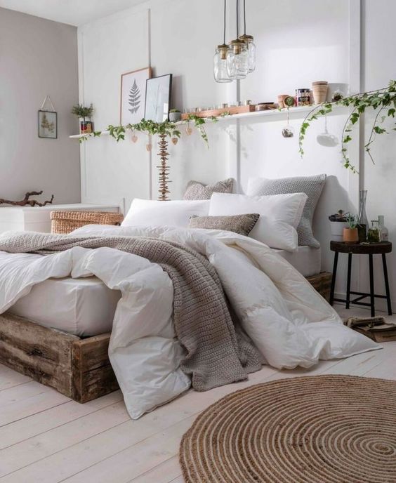
IMAGE: THEINTERIOREDITIOR
Don’t allow such a neutral colour to make your room look drab. Taupe is the perfect blank canvas for bright pops of colour to shine. We particularly love teaming it with greenery and vivacious plants.
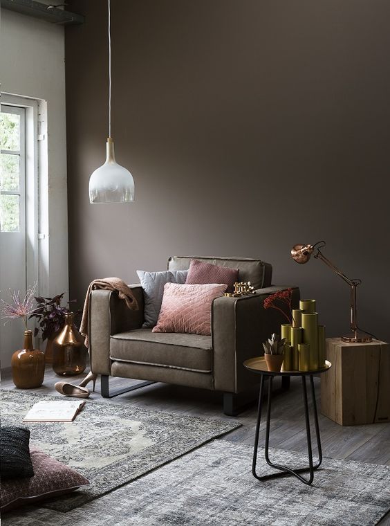
IMAGE: ILOVEMYINTERIORS
Taupe can be ideally utilized in both its shades, light or dark and we definitely love a moodier hue. Paired with rich, luxurious finishes like copper and black metal accents, you can create a seriously sophisticated look.
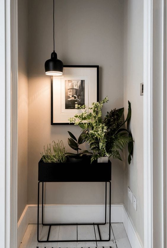
IMAGE: CONCEPTSANDCOLORWAYS
Think outside the box when it comes to the details like storage etc to make the room a little more unique. We love the use of this black metal lamp table to store a selection of potted plants. It works really well against a muted taupe background.
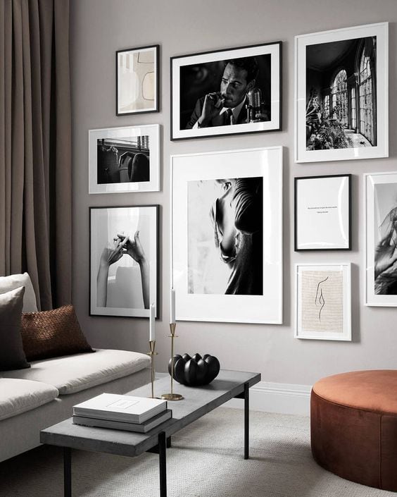
IMAGE: DESINO
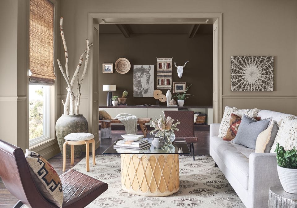
If you’re not adventurous with adding a focal point to your taupe-toned room, it runs the risk of looking a little flat. A gallery wall like this one really adds some interest to the room.