Michael Murphy Home Furnishing
Monday Mood Board: Dulux Colour of the Year – Tranquil Dawn
It’s that time of year again; Dulux has announced the colour of the year for 2020 and she’s a beaut.
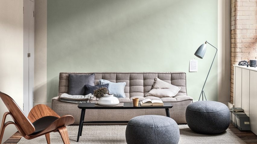
Tranquil Dawn was chosen as a shade inspired by nature and the morning sky, ideal for helping people refocus on meaningful interactions and their human connections as we enter a new decade.
This green-toned shade is ideally paired with warm neutrals or an inviting, colourful palette. With the ability to subtly shift its tone depending on surroundings, Tranquil Dawn is an ideal shade for a new year.
Let’s take a closer look at how you can style the new IT-hue at home:
Whoever said “pink and green should never be seen,” clearly has never paired these two soft shades together for a pop of pastel-coloured goodness. It’s bright and cheerful without being over the top. We’re serious fans.
IMAGE: DULUX
Don’t be afraid to get creative with Tranquil Dawn. Who said this delectable shade must stay purely on the walls? We think it’s the ideal green shade for our kitchen cabinets and ideally paired with a clever hanging basket.
“In an increasingly hectic and digital world, there is a desire for meaning and kindness. So, inspired by the colours of the morning sky, our colour experts have created this inspiring new shade,” explain Dulux about their pick for the year ahead.
We’re big fans of the meaningful and peaceful choice behind Tranquil Dawn, especially when it comes to featuring this shade in the bedroom. This clever hue is calming and tranquil, an ideal choice for a room where we go to be relaxed and quiet in the evenings.
Pair the colour with dark, moody hues to create some drama and interest to the overall look if it’s looking a little too peaceful for your tastes.
IMAGE: DULUX


